Optimization Toolset
Overview
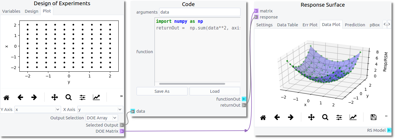
The Optimization Toolset is a collection of nodes which work together to do optimization and analysis via the non-intrusive Response Surface Modeling (RSM) technique. This technique involves creating a Design of Experiments (DOE) which defines a set of design points within a specified range. Each design point represents input values to a model. The model is then executed at each design point and the output is analyzed to create a response. The response is then fit with a response surface which acts as a surrogate or reduced-order model of the original model used to generate the response. The response surface is a mathematical regression which represents the mean behavior of the data throughout the input domain and is generally smooth and continuous (though not required). Further analysis, including optimization, may then performed on the response surface (surrogate mode) which may too costly to do with the original model itself or too noisy to do with the original data.
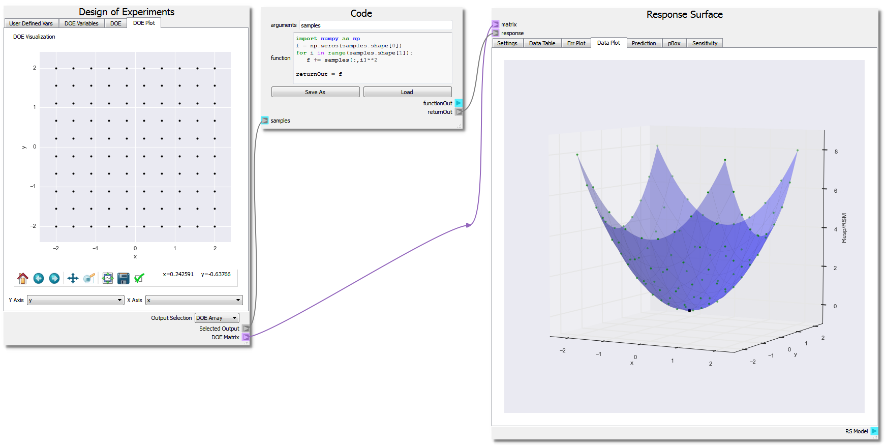
- In general, the RSM modeling technique will involve at least three nodes:
- the Design of Experiments node
- some form of data reduction to a performance parameter which can be done with a Code node
- the Response Surface node
They will generally be configured as shown in the figure below.
This toolset was designed to support optimization of multiphase CFD within the MFiX GUI but can be used outside the GUI. The following examples assume the user has a basic understanding of the GUI capabilities available in nodeworks. Further MFiX-specific examples can be found in the MFiX Interface Examples section.
Ex. 1: Finding the Minimum of a Parabola
This first example will showcase the basic features of the Optimization Toolset by finding the minimum point of a parabola given by the function: f(x,y) = x2 + y2, over the domain -2.0 <= x <= 2.0, -2.0 <= y <= 2.0. Analytically, the minimum point can be found at (x,y) = (0,0). However, the RSM technique will be used because it illustrates how to perform optimization/analysis when the model is noisy such as is often the case in CFD and is worse in multiphase CFD.
Design of Experiments
The DOE node is used to set up input variables and the domain ranges which get fed to the model. The DOE node has multiple tabs and functions, is designed to be used from left to right, top to bottom.

In the first tab, Variables, variable names, types, and ranges are defined. In this example, two variables are defined ‘x’ and ‘y’ and are assigned to be double precision.
To add a variable, press the  button. Enter the name x in the
variable field. Make sure the that type is Double Percision. Enter -2.0 in
the from field and 2 in the to field. Finally, enter a value of 10 in
the steps field.
button. Enter the name x in the
variable field. Make sure the that type is Double Percision. Enter -2.0 in
the from field and 2 in the to field. Finally, enter a value of 10 in
the steps field.
Repeat the steps to create a y variable that ranges from -2.0 to 2.0 with 10 steps.

In the third tab, Design, users create the desired DOE. There are several different DOE methods available in a drop-down combo box. In this example, the ‘factorial’ method is chosen. After setting up the type of design of experiments, clicking the Build DOE button generates the design points within the DOE and they are displayed in the table below the Build DOE button. There is a Samples box which is enabled or disabled depending on the selection of the DOE method. If the method needs a total number of samples to generate rather than a number per variable, this box will be enabled and required. In the case of a factorial, the number of samples is the multiple of the number of steps for each variable. In this example, it is 100.
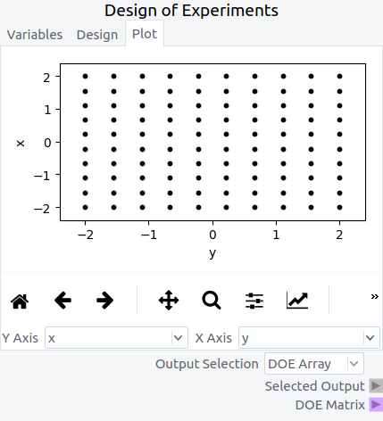
In the fourth tab, Plot, the DOE is visually displayed. In this example, showing the ‘y’ variable on the ‘Y axis’ and ‘x’ variable on the ‘X Axis’ displays each design point in the DOE as a black dot. The ‘Output Selection’ combo box is set to ‘DOE Array’ in order to output a numpy array of the DOE to be used later through the ‘Selected Output’ terminal.
Numerical “Experiment” Output Response: Code
The highly versatile Code node is used in this example as the numeric model. Note that the Code node is not strictly needed as users can effectively do the same operations using a set of Nodeworks nodes. However, it is often easier to write a few lines of code than it is to develop a workflow.

import numpy as np
f = np.zeros(samples.shape[0])
for i in range(samples.shape[1]):
    f += samples[:,i]**2

returnOut = f
The Code node as setup above takes the “Selected Output” from the DOE Node as an input labeled as “samples”. The code is written in a generalized way utilizing the numpy arrays to generate the parabola in as many dimensions as are present in the DOE setup. The response, here “f”, is set as the “returnOut” from the Code node, which sets the output as the response from the parabola function over the given DOE domain.
Response Surface
The Response Surface node is used to fit a Response Surface Model to the model response and analyze/optimize on it. Similar to the DOE node, the Response Surface node is set up with multiple tabs to be used from left to right, top to bottom.
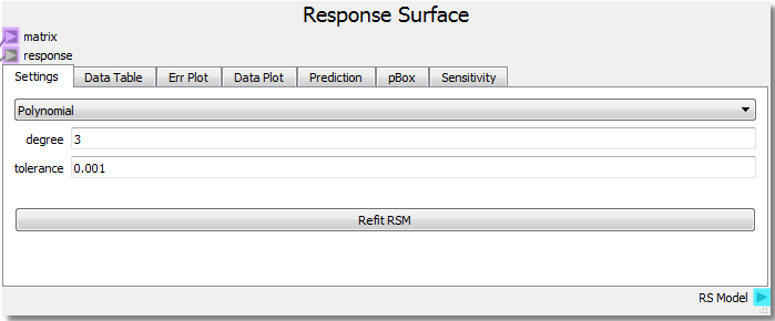
The Response Surface node takes the “DOE Matrix” output from the DOE node as input to the “matrix” terminal and the “returnOut” from the Code node as input to the “response” terminal once the sheet has been run by clicking the Run/Pause button at the top left of the sheet. This gives the Response Surface node information about the DOE domain and the response of the model. In the first tab, Settings, parameters for the response surface surrogate model are set up. In this example a 3rd degree polynomial will be used to create a RSM fit to the model output, in this case a parabola.

In the second tab, Data Table, tabulated values of the input domain from the DOE alongside the response and the RSM surrogate model are displayed. The data can be sorted by any column and operated on through a right click context menu.
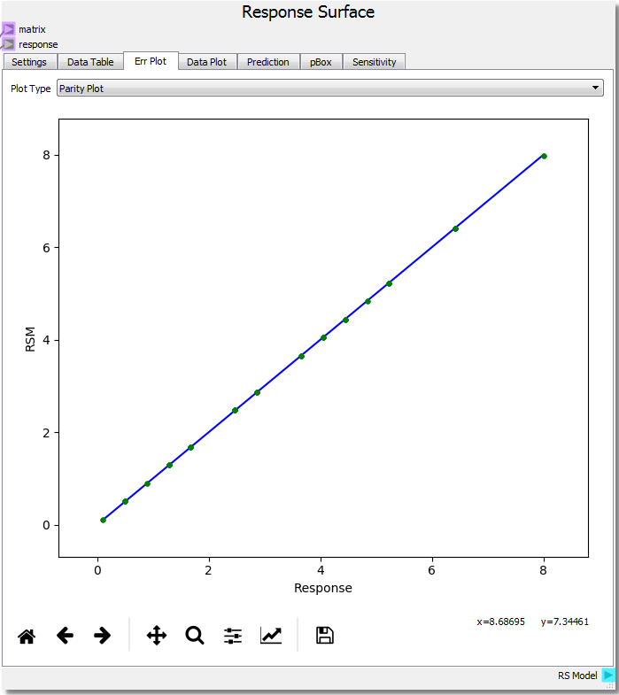
In the third tab, Err Plot, the error of the RSM relative to the model response can be visualized and analyzed. There are three ways of displaying the information. First, a Parity Plot displays the RSM prediction against the model response. Second, an Error Plot shows the absolute RSM error vs the Response. Lastly, the histogram plots a histogram of the absolute error between the RSM and the Response.

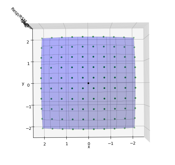
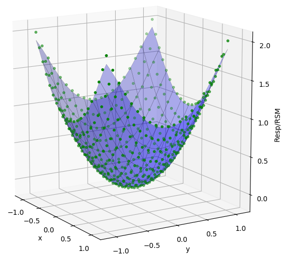
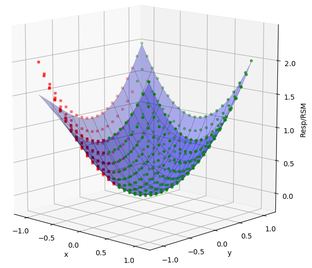
In the fourth tab, Data Plot, the response as points are displayed along with the RSM as a line/surface depending on dimensionality of the problem. The plot displays the parabola function as expected. The user can click to select data points on the plot, and click-hold and drag the pointer around to rotate the image.

To perform an optimization and find the minimum of the parabola, first select a point to be used as an initial guess. A selected point will be highlighted. From there, right clicking the mouse will open a context menu with several options. Under “Optimize”, select “Find Minimum”.

A black point will be added to the surface indicating the minimum point. Right-clicking and choosing “Print Selected Points” will print to console the coordinates of the selected minimum point: (x, y, response) (-5.5349641806636355e-09, -5.5349641806636355e-09, 0.015743892284213752). Both x and y are essentially numerically 0 which is expected.
This example can be accessed from
examples/sheets/optimization_1.nc
Ex. 2: Refinement
This extension builds on Example 1 and will investigate the numerical response given at the minimum point. The analytical solution at the minimum for f(x,y) = x2 + y2 should be f(0,0) = 0, yet the response surface result is at ~0.016, close to 0, but let’s see if we can get closer to the true minimum.
Rotating the response surface to view the domain from the bottom, we can see where the DOE sample points are in green and the minimum point in black. Since the response surface is a best-fit curve about the response points it is possible the surface isn’t refined enough to capture the true value at the optimum point. It is often good practice to refine the DOE around the found optimum point. Changing the range from -1.0 to 1.0 for both x and y plus increasing the steps from 10 to 21 increases the resolution around the optimum and provides a response point very near the previously found RSM optimum. Performing the minimization again places the optimum at near zero once again, and the response value at 0.015243289834525817. While this did not significantly improve the RSM prediction at the optimum, it is generally good practice to verify using this procedure.

Ex. 3: Response Surface Type
Refining the grid around the optimum is good in practice, yet the type of model used to fit the response and generate the surface also has a large impact on the accuracy. In the example at the minimum value of (0,0) the function should take on the value of 0 as well but did not at ~0.015. The Response Surface node also incorporates a Gaussian Process regression to fit the model response.
Just from using the default values for the Gaussian Process fit, the RSM value at the minimum is 0.00764619005004, a closer value to 0.0 than the polynomial. From both the Data Plot and the Err Plot one can see that the Gaussian Process is a better fit inside the domain but loses some accuracy around the edges as there are fewer response points to tie the surface. Adjusting parameters such as the “nugget” to a value of 0.001 brings the surface fit value to -0.00076273554, another order of magnitude closer to the analytical value. This also provides a closer fit around the response values at the edges of the domain.
More information about the Gaussian Process used to fit the data along with the various parameters can be found in the scikit-learn documentation .
When refining the grid or changing the model it is best to assess the impact of the changes via the Error, Parity, or Histogram plots. In particular, using the fit histogram option in the right click context menu of the histogram plot allows one to determine the standard deviation of the error which can be used as a measure of goodness of fit. It is left to the user to explore these impacts.
Ex. 4: Rejecting Data
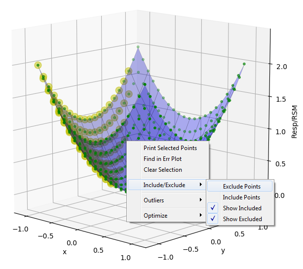
Sometimes when performing an experiment a response from a run at a DOE point has unreasonable errors, doesn’t fit the expected trend, or can be eliminated by expert judgment. The RSM node has the ability to select and exclude data from the model fit. To exclude a set of data, hold the SHIFT key while dragging the mouse pointer over the desired points on the Data Plot to highlight them. Next right-click to bring up a menu, then click “Include/Exclude” and “Exclude Points”. The points will turn red and the surface will refit to the reduced dataset. To include points, again select them, and choose “Include Points” instead. Points can also be selected and excluded/included from the Data Table tab and the Err Plot as well.
Ex. 5: Propagation of Uncertainty
The Prediction tab in the Response Surface node allows one to make predictions of what the response may be given a certain level of uncertainty in the input variables without having to run new experiments by sampling the surrogate model response surface instead.
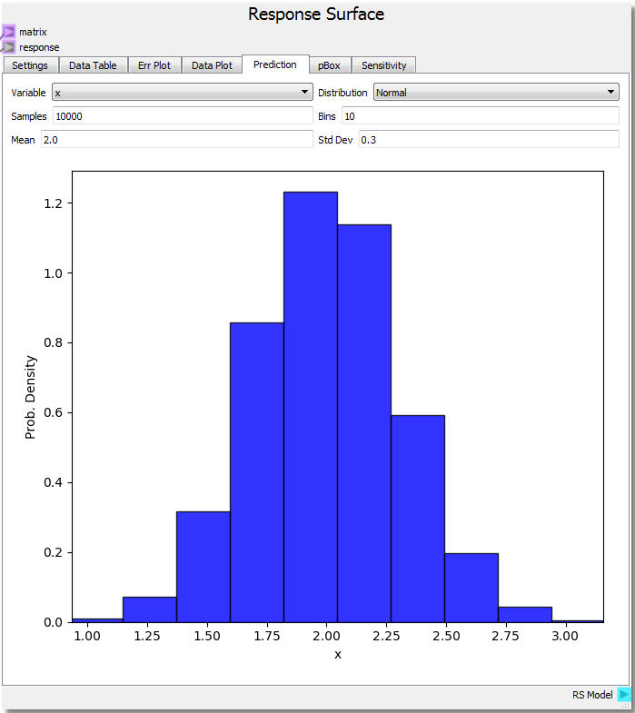
For the parabola example, let’s set the DOE range from 0.0 to 3.0 with 21 steps for x and -1.0 to 1.0 with 21 steps for y and run the sheet again. If we knew that the variable x was normally distributed with a mean of 2.0 and a standard deviation of 0.3 the probability density for x sampling 10,000 times across 10 bins is shown in the figure. Assuming we knew the variable y had very little to no variate we can also set the mean to 0.0 and standard deviation to 0.0001 by selecting the y variable.
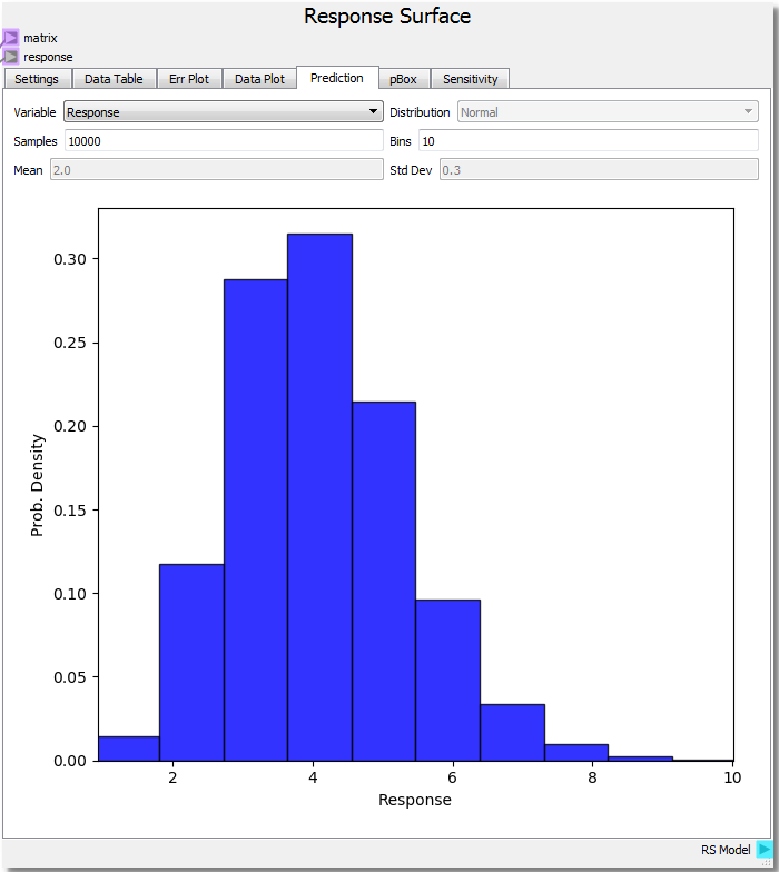
With the input variables set we can predict how the response would behave by selecting Response from the drop-down combobox. We see a chi-squared distribution around 4.0 which makes sense given our parabolic function, average value of 2.0 for x and 0.0 for y resulting in 2.02 + 0.02 = 4.0 average. It is important to note that the confidence of the prediction capabilities of the surrogate model extend only so far as the domain about which it is sampled. This is why it was chosen to rebuild the DOE over a new range in order to illustrate this extension.
Ex. 6: Sensitivity Analysis
The Sensitivity tab on the Response Surface node allows for analysis of how sensitive the response is to the input variables.

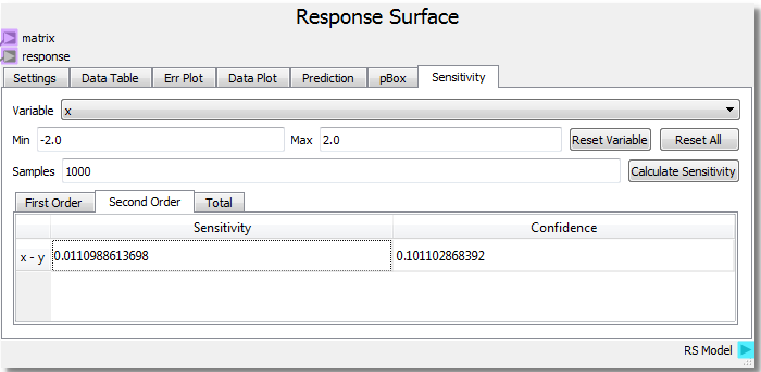
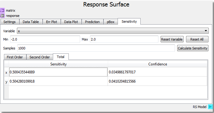
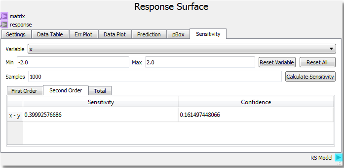
Using the parabolic example as a starting point, setting the number of samples to 1000 and clicking Calculate Sensitivity, we can see that the x and y input variables contribute roughly equally (~0.5) to the response on the First Order basis. This tells us that x and y both independently contribute equally to the response. The Second Order result shows that the x-y interaction contributes very little to the response. Looking at our function f(x,y) = x2 + y2 we see that there are no cross terms that generate interdependency of the response to both variables at the same time. Said in geometric terms, any x plane intersection can be swept along any y plane intersection and create the same surface.
Let us modify our Code node to incorporate the following change to our function: f(x,y) = x2 + y2 + x*y.
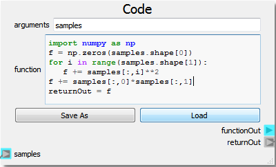
import numpy as np
f = np.zeros(samples.shape[0])
for i in range(samples.shape[1]):
    f += samples[:,i]**2
f += samples[:,0]*samples[:,1]
returnOut = f
This modification should add an x-y interaction term. Rerunning the sheet to incorporate the new function and calculating the sensitivity analysis yields:

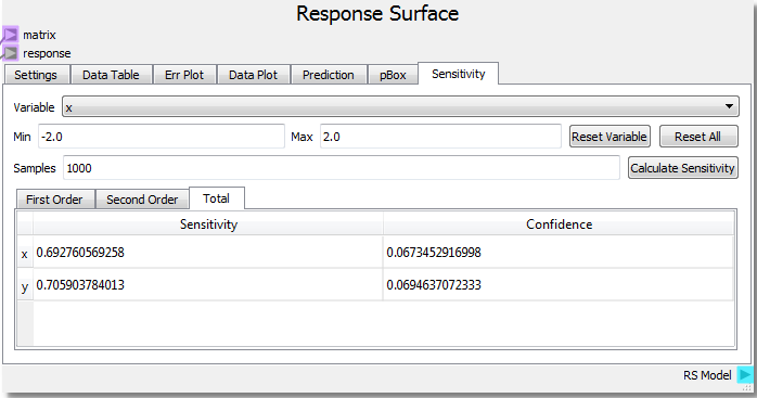
From the new analysis we can see that the added x*y term increases the second order x-y interaction sensitivity to the response. For more information and references regarding the SOBOL method employed for sensitivity analysis, see the direct link to the SALib SOBOL Module .
Ex. 7: 3D Subspaces
The Response Surface node has the ability to slice into high dimensional spaces in order to visually display 3d subspaces. Let us add a 3rd input variable to our function: f(x,y,z) = x2 + y2 + z2 . The Code node was written in a general way that can handle the new input variable without modifying the code. Let us also set up the DOE to cover each variable from -2.0 to 2.0 with 11 steps.
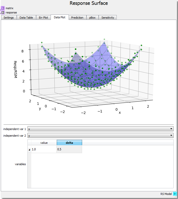
Running the sheet and viewing the Data Plot the Response Surface node has new options. A 3-dimensional figure uses 2 independent variables on the domain plus the response value to create the plot. If x and y remain the independent variables, z can be given a value and a delta to create a 3-dimensional hypersurface of a 4-dimensional object. Setting the z value to 1 means we are viewing the RSM hypersurface at the isovalue z = 1, which is our parabolic response surface from before with an added value of 1. The delta value sets the range of response data near the isovalue of the RSM, since it may be unlikely that any response is exactaly equal to the isovalue at which the RSM is evaluated. Here, we set a delta of 0.5 to view all response points that are no more than 0.5 away from the value of 1 set for z. This allows us to not only view the hypersurface at the set z value, but also see how the surface fits nearby data.
Ex. 8: Probability Box
The probability box method is another approach to uncertainty quantification. The pBox tab of the Response Surface node explores the user to sample the RSM by separating aleatory and epistemic uncertainties. Aleatory uncertainties are also called irreducible uncertainties or variability are characterized by a measured or observed probability distribution that characterizes the likelyhood of a givne value. On the other hand, epistemic or reducible uncertainties are due to a lack of knowledge and are characterized by uniform intervals, i.e., any values within a given range are equally likely. The uncertainty quantification (UQ) method of Oberkampf and Roy (2010) emphasizes separating these two sources of unknowns.
Let us assume that our input variable x has a value between 0.0 and 1.0 yet we do not know how the values are distributed (epistemic uncertainty) and our input variable y is normally distributed with a mean of 1.0 and standard deviation of 0.3 (aleatory uncertainty). Setting the number of aleatory samples to 1000 and epistemic samples to 100 using a Latin Hypercube sampling method creates a response array using the RSM. This array contains an aleatory sample distribution for every epistemic sample (1000 by 100 array for this case).
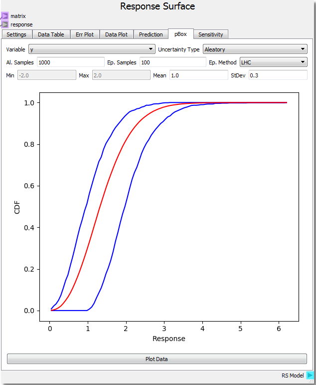
Using the Plot Data button near the bottom of the tab generates a Probability Box (pBox). The blue lines represent the upper and lower bounds on the Cumulative Distribution Function (CDF) created by the epistemic uncertainty while the red line represents the combined CDF over all samples. In this example, the probability of getting a response value of 2.0 is around 40%. This is estimated by subtracting the upper bound CDF value at the response value of 2.0 (roughly 95%) from the lower bound value (roughly 55%). Another interpretation is to say there is a 60% probability of attaining a value of less than 1.0 to 2.0 (that is it is equally likely to get a value of 1.0 or less as it is to get a value of 2.0 or less). The effect of the epistemic uncertainty is to loosen the predictive power of the aleatoric uncertainty. If all of the uncertainties were aleotoric, the pBox would collapse to the red line. This also happens if the epistemic uncertainty range shrinks to zero. As the range shrinks down, the probability of attaining a single value also shrinks to zero, and one is limited to determining the probability of existing in a range. The effect of epistemic uncertainty is to always broaden the probability range of a given response value/range. In this case, if the epistemic uncertainty was reduced to zero, the probability of getting a response between 1.5 and 2.5 would be ~35% (95% - 60%). However, the epistemic uncertainty makes this probability much broader at ~82% (100% - 18%). The interpretation breaks down when the epistemic uncertainty becomes too broad creating a range where it is 100% likely to find a response. In these cases, it is best to say that there is too much uncertainty to make a valid probability prediction within the 100% likely range.

Let us now assume that the range of values for the x input variable is instead 1.0 to 2.0. This has the effect of widening the pBox since our parabolic equation has a wider response over this range. The probability of attaining a value of 2.0 has increased to 60%. Notice also that one cannot make a prediction of uncertainty between the response range of 3.5 and 3.9 as every value is 100% probable. More information about the Probability Box can be found in the following journal articles:
Validation and Uncertainty Quantification of a Multiphase Computational Fluid Dynamics Model